Mia Digital Collections
In this Case Study
Mobile-Forward
Existing Design
Tech Constraints
Tools and Deliverables
Participant Observation
Kano Analysis
Directed Storytelling
Card Sorting
Sketch
Framer X Prototype

User experience at the intersection of physical and digital spaces.
The Problem
Minneapolis Institute of Art is interested in increasing usage and improving usability of their web-based visitor tools, including their Collections website.
The Solution
Our two-person design team conducted user research and prototyped a mobile website experience that supports the different ways visitors experience the museum collection.
What Surprised Me
With a two-week design scope, we needed to narrow down the users and use cases that were a priority for the stakeholder. This was an exercise in setting aside our biases and areas of interest as designers to focus on incremental, implementable outcomes.
View Prototype
(PDF Download)
The Client
Minneapolis Institute of Art (Mia) is one of the largest art museums in the United States. Free for visitors, it relies on public funding and private donations. Its encyclopedic collection of around 90,000 art objects is catalogued on a digital collections site, collections.artsmia.org.
In a meeting at the outset of this project, our stakeholder said that Mia’s primary motivation was to “give the collection to the public in whatever way they want to access it.” Connecting the community to the collection is an important strategic initiative, according to the outgoing director, Kaywin Feldman. In a 2018 interview, Feldman noted, “We love the label of ‘The People’s Museum.’”
Users and Audience
Mia’s digital tools have the following users and use cases:
In-gallery users may access the Collections website on their mobile device and search for an object on view using its name, title, or accession number, in order to find additional information or an audio tour clip.
Museum visitors explore the collection in different ways. Some may come to the museum with the purpose of seeing a particular museum highlight or a special exhibition, but Mia’s surveys show that 65% come to the museum without a specific plan. Therefore, our solution would need to support both goal-oriented and exploratory users of the museum and collection.
In consideration of Mia’s values around public access and engagement with the collection, we also considered community members who wish to see themselves reflected in the collection and to have an entry point into conversations around art.
We created two user archetypes to encompass these in-gallery use cases:


Team and Role
I partnered with fellow UX Designer Tom deBruyn. We divided our research efforts to maximize our findings in a limited timeframe. Tom and I then worked together to prototype an interactive gallery map and a revised, user-centric structure for individual object records on the collections site.
The Process
Designer Walkthrough
Our walkthrough of the existing digital experience revealed some usability issues on different devices. We also began to understand the tools, interactions, and functions on the existing site. IWe found that the Collections site appeared to be mobile-forward, and serves the following main functions:
Retrieving indexical information about a work of art
Viewing high-resolution images and detailed commentary
Retrieving audio clips for a self-guided tour experience
Directing traffic to the museum blog and current events articles curated by museum staff.
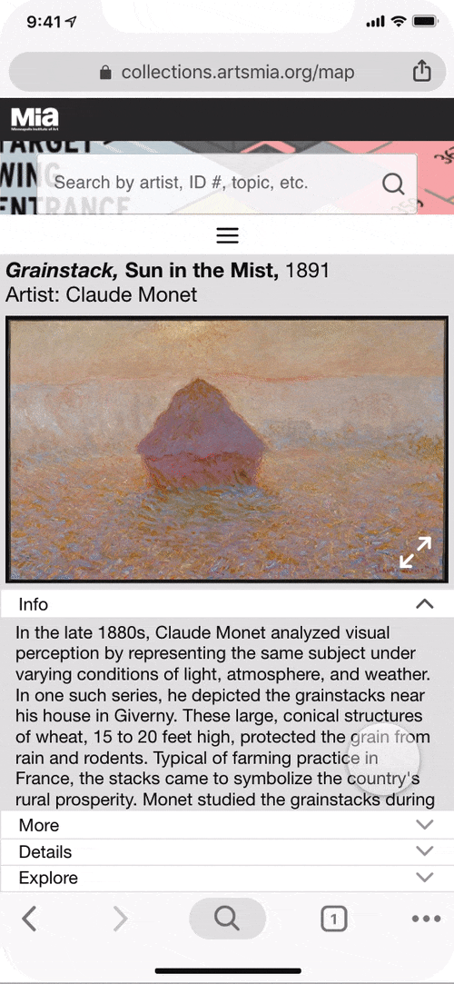
Our initial findings around usability were related to the tendency of the site to break in desktop view, and low immediate visibility to what types of information users would expect to find as they scroll the long Object Record (a page for a single artwork).
As new users ourselves, it took some time to learn where to find the information available here, which also varied depending on the object record we were viewing—certain popular objects contained a richness of commentary and exploratory features, whereas others contained only information about date, provenance, and dimensions, for example.

An Object Record for an item in the collection (right-hand side of this desktop view). The desktop view breaks when a user attempts to scroll down.
Competitive Audit
To begin to understand possibilities for museum visitor tools, I conducted a competitive audit of tools at Mia and Art Institute of Chicago (AIC)—a similarly large, encyclopedic art museum in the Midwest.
The audit revealed a range of ways in which Mia and AIC give their visitors access to their collections. Whereas Mia is focused on a web experience, AIC has taken on the challenge of developing a native mobile app to support visitor way-finding in addition to delivering information and audio commentary for works on view.
Due to Mia’s limited development resources, we chose to focus our design work on the web experience rather than prototyping a native app.
Participant Observation
We needed to understand the experience of Mia’s digital tools from the perspective of an in-gallery visitor. In a visit to the museum, we found some signage at the museum entrance invites visitors to use the website on their mobile device. However, once a visitor is in the gallery, there are very infrequent reminders. Visitors may retrieve Object Records on the site through a search for an artist, a title, or by accession number. Accession numbers were difficult to find on the didactic placards. This was due to their small font size, lack of labeling, and varied makeup of numbers, letters, and decimal points.

We also observed that some departments contain other types of digital experiences, such as touchscreens, iPads, and video stations. A stakeholder interview revealed that these represent a patchwork of funding sources and initiatives over time. We understood Mia’s focus on leveraging a free and ubiquitous resource—visitors’ mobile phones—to the greatest extent possible. It is a scalable way to support digital experiences for more works and departments over time.


During a monthly community event, we intercepted visitors for brief interviews about their experience with Mia’s website tools for visitors. We found that none of the visitors we interviewed were aware that the tools existed. However, when shown the tools and how to search for works using the accession numbers displayed on the placards, visitors reacted positively.
Secondary Research
I was interested in learning about ways in which the digital tools could support the museum’s mission of connecting the community to the collection. “Access” to the collection can mean different things to different users: for remote users, this may mean a digital experience that delivers more than indexical information, and conveys some part of the in-person experience with an object. For in-gallery users, “access” may imply an entry point into the collection, such as an invitation to share reactions or experiences. This would serve visitors who may feel excluded from conversations around Mia’s collection due to a lack of experience with art or due to cultural barriers such as minority status.
I read work by Nina Simon, an expert on participatory museum experiences, to hypothesize ways in which Mia’s digital tools could support visitors connecting with the objects on view.
Directed Storytelling
I collected oral testimonies in order to understand in-person experiences with art, and to hypothesize the ways in which the digital experience might convey this to remote users as well as facilitate community discussions around the works in the collection.
I recruited 8 people from my contacts to record their reactions to a directed storytelling prompt:
Tell me about a time when you experienced a particular art piece (a painting, a sculpture, a photo, a dance, a play) that moved you when you saw it in person.
In describing their experiences with art (including museum objects, performances, and public installations) these users recorded reactions ranging from sensory memories to connections with their own lives. Though my recruitment method for this activity introduced selection bias (my friends and family’s experience and culture overlap significantly with my own), this was a rich source of data for understanding the in-person impact of artworks and the range of visitor experiences.
I would need to broaden my reach in order to gain insight into user attitudes about sharing these experiences with others.
Kano Survey
I widened the audience by distributing a Kano survey to anonymous users recruited via LinkedIn and a Slack community. I prototyped 6 feature scenarios illustrating ways in which Mia’s website and in-gallery experiences might intersect.
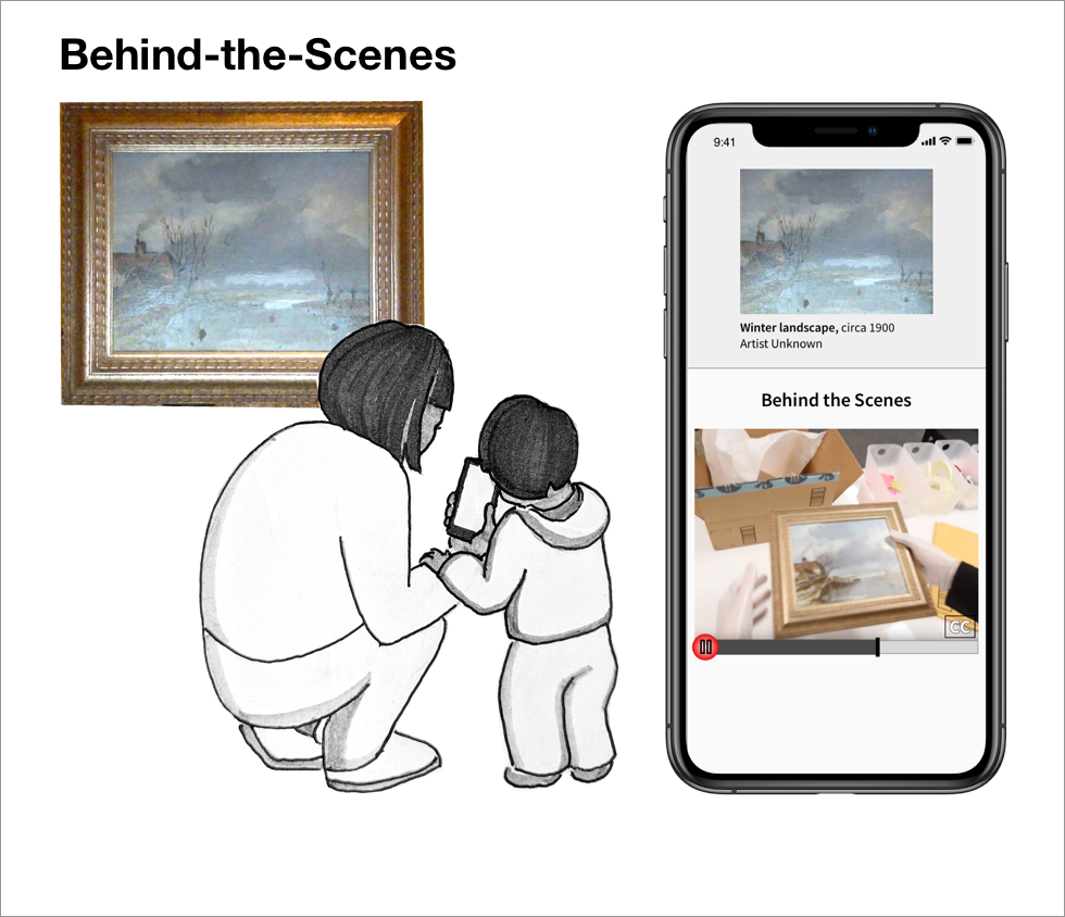
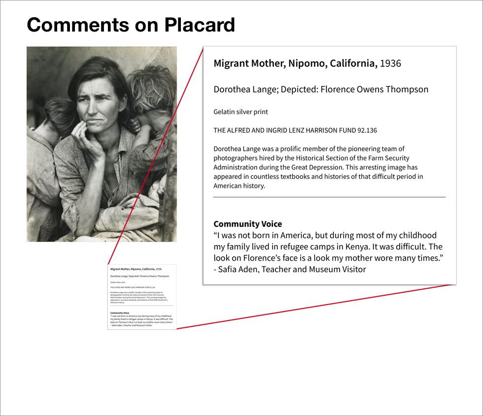
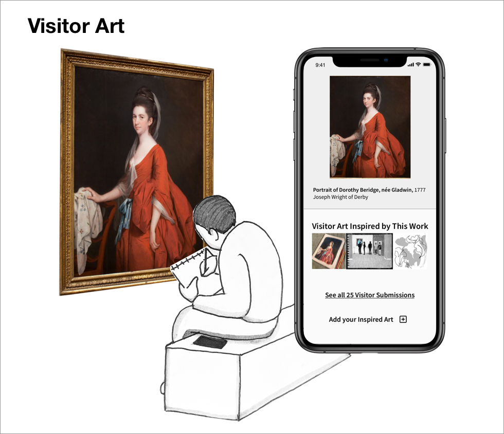
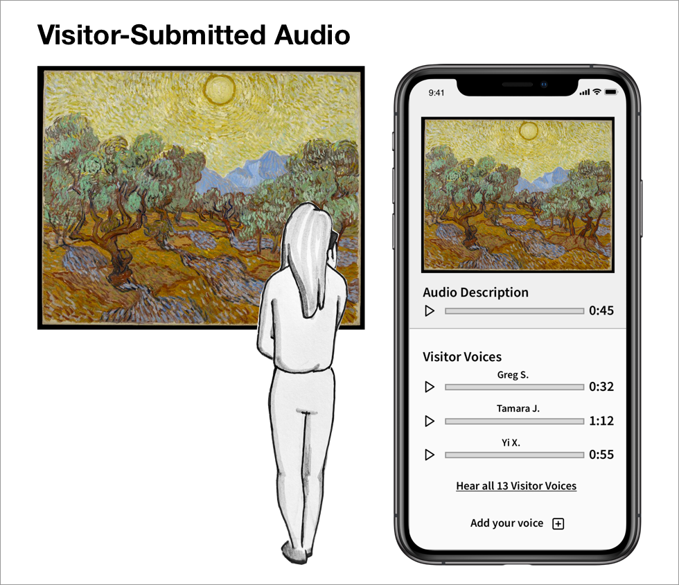
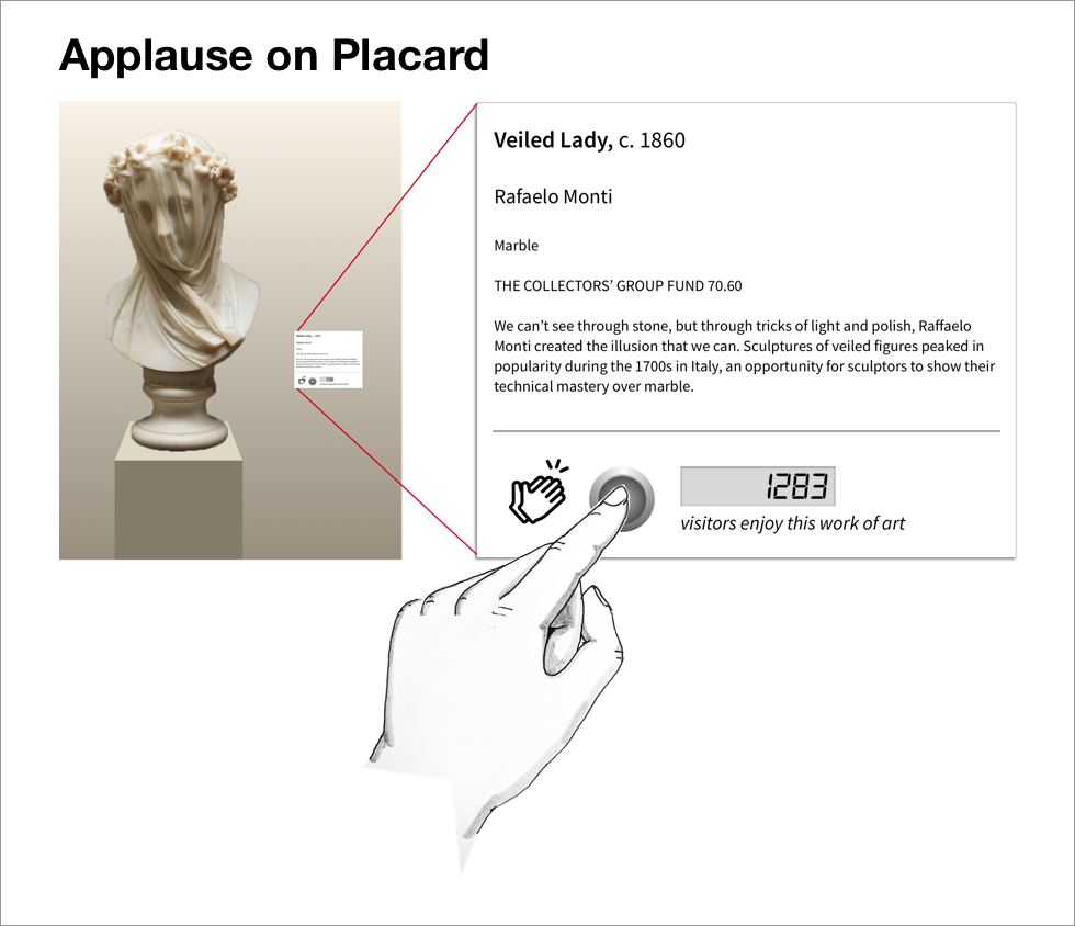
I was surprised to find that despite the richness of visitor experience shared with me through directed storytelling, respondents to my Kano survey were very divided in their opinions about avenues for sharing their reactions or seeing community voices alongside artwork. Reactions included concern that visitor participation would hinder or cheapen the transcendent experience of the artwork. Three features were at least agreed upon as falling within the Kano domain of “Attractive,” so I moved forward with prototyping a digital experience that included these features.
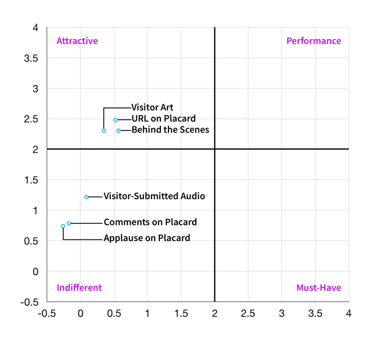
Kano survey analysis from 23 respondents shows three features were deemed “Attractive.”
Card Sorting
Finally, I conducted a collaborative card-sorting exercise with three users in order to gain insights around their pain points with parts of the existing Object Record and and priorities for different types of information and features.
This exercise delivered three key insights:
Users wished to see detailed commentary for works front and center, to support self-guided exploration in the museum.
They stated that links to museum blog articles and news items were perplexing at best, and seemed like “clickbait” at worst.
They saw the value of indexical information such as accession number, dimensions, and gallery location for a remote or scholarly researcher, but desired to move this out of sight to declutter the experience.


I incorporated these insights into a restructured Object Record to prioritize the in-gallery use case, without compromising remote users.
Prototype
My fellow designer and I came together with our research insights to prototype a digital experience that would support the different modes of goal-oriented and leisurely exploration of the galleries. With an enhanced interactive map, we are supporting museum visitors with a destination in mind, as well as those wishing for an exploratory or thematic thread to guide them through parts of the collection. Finally, the restructured object record uses principles of expandable content to give immediate visibility to the types of information available, as well as incorporate three participatory new features.
View Prototype
(PDF Download)

Our prototyped interactive map to support both goal-oriented and leisurely explorers.
Our prototype of a restructured Object Record with expandable content.
Conclusion
Next Steps
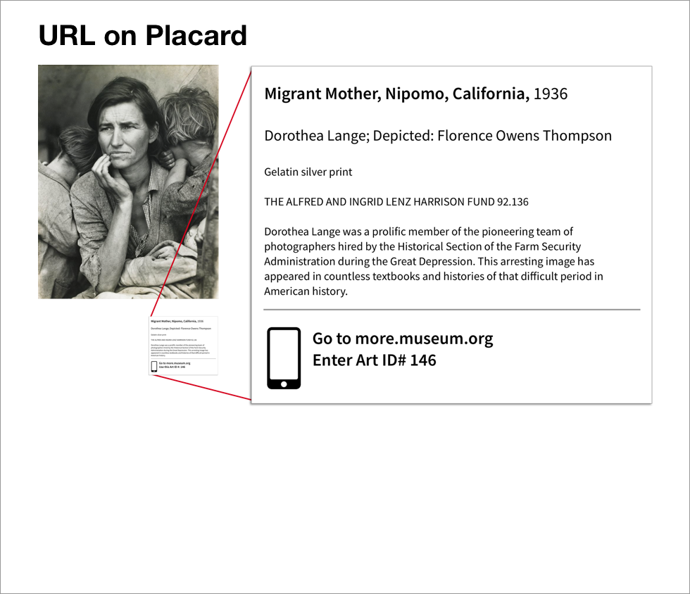
The next step for this project would be usability testing of our prototyped experience. It would also be worthwhile to prototype and test various ways of lending visibility to the Collection site within the galleries. One possibility is to place the Collections URL on the didactic along with a standardized, integer-only “Art ID #” to aid in searching. Another way to bring users directly to the mobile Object Record would be to use NFC tags inside the didactic placards next to each piece of art.