Moody Foodie
In this Case Study
New Product Design
Mobile-First Design
Tools and Deliverables
Directed Storytelling
Sketched Wireframes
User Flow
WireFlow
Interactive Prototype
User Prototype Evaluation
Sketch
Axure

The Problem
Foodies looking for their new regular joint, or seeking a reservation, desire clear expectations for their restaurant experience.
The Solution
I conducted discovery research in the form of directed storytelling to determine what types of information users need before reserving a restaurant.
You can view my interactive prototype on Axure Share.
What Surprised Me
Usability testing revealed the need to simplify the visual interface and present user actions sequentially, so as not to overwhelm users with information. I decided to leverage simplicity to encourage leisurely browsing.
Moody Foodie is an app designed to help a user find a restaurant to reserve a table or join a wait list. It combines logistical information, including parking availability and cost, with more qualitative filters such as mood and vibe. Here are snapshots of my design process, from directed storytelling to prototyping and usability testing.
Directed Storytelling
Three target users participated in a Directed Storytelling exercise aimed to gather information about how they make reservations or go about choosing a restaurant to visit. Key information gathered included the modalities and tools used by these partipants: phone calls, web searches, and apps. Additionally, they revealed what types of information they find where. For example, reservations and wait time are available in two popular apps, but information about a restaurant’s “mood” or “vibe” is usually elicited by visiting the restaurant’s own website or reading reviews. Names have been changed to protect the storytellers’ identities.

Excerpts from Directed Storytelling transcript notes

This exercise helped me to develop a user goal: The user desires clear logistical information as well as mood/vibe information about the restaurants they will visit.
Sketching screens and user flow
I compiled a list of features and user tasks based on Directed Storytelling data. I created sketches of key screens in the app and began to build a wireflow of “red routes” in Sketch.


Moody Foodie wireflow
Prototyping
I recreated key screens in Axure as a clickable prototype in preparation for a usability test.

Moody Foodie app dashboard

A Restaurant Details page

Filters available on Reservations page
Usability Testing
I recruited three users for a usability test of a clickable prototype. A Think-Aloud protocol was used to gain insight into the participants’ intent, motivation, and frustration or perceived success. They were given two tasks:
1. Find a reservation for this Friday for yourself and three other people
2. Find a place to eat tonight and join the wait list


Recommendations and Revisions
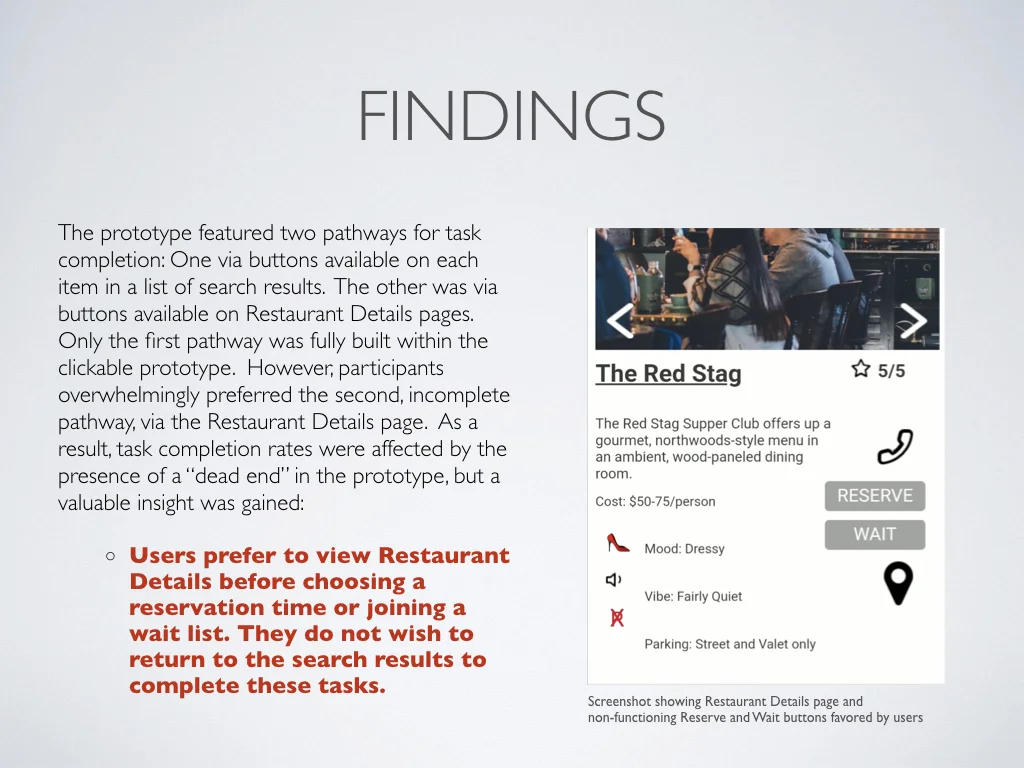
The key finding in usability testing was a clear user preference for selecting a reservation or joining a wait list ONLY AFTER viewing a Restaurant Details page. Based on this finding, I recommend cleaning up and de-cluttering search results to leverage users’ attention to pictures and restaurant names, and to make browsing search results more enjoyable.
I will place “reserve” and “join list” functions on the restaurant details page to declutter search result thumbnails and avoid visually overwhelming the user.
Additional Findings
Another usability finding was confusion regarding an important form field when seeking a reservation: Number of Guests. In usability testing, participants were confused by this wording and frequently excluded themselves, considering “guests” to refer only to the diners joining them. This would lead to some frustration on arrival at the restaurant! I proposed clarifying the language of this form field.
Additionally, participants expressed a desire for more accessibility/visibility of user-submitted reviews—information they deemed trustworthy as well as useful. A revision of the Moody Foodie prototype will include greater visibility of user reviews.

A proposal for visually decluttered search results

Revised “Number of Guests” selector